First published on August 11, 2014 by Emily Larson
It’s an exciting time for the LAT Multilingual team; we’ve been rapidly growing and adapting as a company to stay on top of the ever-evolving world of cultural marketing. Sometimes it’s hard to believe our company is already celebrating its 15th anniversary! From starting out in 1999 as L.A. Translations & Design, to becoming LAT Multilingual Translation & Marketing in 2013, there’s been a lot of change, yet a lot of continuity. Few people know this better than graphic designer Pascal Bouchard, who has been working with LAT since he designed our first logo. We asked Pascal to reflect on his time with LAT, and here’s what he had to say:
How did you first get involved with LAT?
I first got involved with LAT in 2000 when I moved from Québec to beautiful Vancouver. In fact, I got off the plane, went directly to LAT for a job interview, and was hired on the spot to work in their design department. My first assignment was to create a corporate identity for the company. Coming from a small town, I was very excited to work with people from so many different backgrounds, and was thrilled by the opportunity to adapt my designs to different languages and markets. After 2 years, I started my own design studio, but have continued working with LAT ever since as a contractor.
You’ve been with LAT from the beginning. When we decided to rebrand last year, what was your process for coming up with a new design, while remaining true to LAT’s roots?
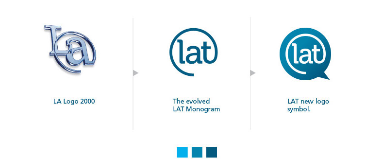
LAT has always been committed to bringing people together by breaking language barriers and constantly providing high quality services. The previous logo was an expression of that commitment to quality, but it had a traditional, print-media look. It needed to change because LAT had become a more modern, internet-oriented and social media savvy organization. As such, the blue circle speech bubble in the current logo represents new global markets, localization, positioning, and social media. However, we made sure that the new logo expressed an evolution, and not a complete departure, from the previous version in order to maintain the valuable brand recognition that LAT has earned over the years.

The evolution of LAT’s logo: L.A. Translations to LAT Multilingual.
What is the design logic/vision/inspiration behind LAT’s brand-new website layout?
LAT Multilingual is a boutique translation and digital marketing company based in Vancouver with offices in Montreal, Toronto, and San Francisco. They help companies engage with local demographics in their own languages. In order to expand their market globally, LAT adapted and expanded its language and localization expertise to help companies be more active and effectively engage with their customers on social media.
The main goal for the new website was to simplify the user experience by including a clean & refined imagery and clearer navigation. The overall design elements were balanced to allow the information to flow and be easier to consume so that LAT’s services could be immediately understandable and accessible. We endowed the site with a bold and contemporary eye-catching design so that LAT can stand out among competitors and attract new audiences.
How does LAT’s emphasis on multiculturalism influence your design decisions?
It’s a fact that 70% of people using the Internet speak a language other than English. I have kept this statistic in mind from the beginning, knowing that a fundamental characteristic of the site is that it has to easily adapt into different languages. Understanding that some languages, like Persian, read from right to left, or that Chinese readers prefer blocks of condensed information as opposed to white space breaks, inspired me to create a look that could be adapted to the preferences of a wide variety of potential customers.
From your perspective, how have you seen LAT develop these past 15 years?
In my opinion, the key factor to LAT’s success has been its recruitment and retention of excellent staff. Since I joined many moons ago, I have consistently been impressed by the technical expertise and aptitude for customer service of LAT’s growing staff of translators, teachers, marketing experts, etc. Selecting and investing in fantastic personnel has helped LAT stay at the vanguard of the translation and digital media market, permitting agile expansions into social media, staffing, and other areas that have allowed the organization to exceed customer expectations and stay ahead of the competition.
 Pascal Bouchard is a graphic designer specializing in the field of brand identity. He works with clients of all sizes from his studio in Vancouver, Canada. Learn more about Pascal’s work here.
How did you first get involved with LAT?
I first got involved with LAT in 2000 when I moved from Québec to beautiful Vancouver. In fact, I got off the plane, went directly to LAT for a job interview, and was hired on the spot to work in their design department. My first assignment was to create a corporate identity for the company. Coming from a small town, I was very excited to work with people from so many different backgrounds, and was thrilled by the opportunity to adapt my designs to different languages and markets. After 2 years, I started my own design studio, but have continued working with LAT ever since as a contractor.
You’ve been with LAT from the beginning. When we decided to rebrand last year, what was your process for coming up with a new design, while remaining true to LAT’s roots?
LAT has always been committed to bringing people together by breaking language barriers and constantly providing high quality services. The previous logo was an expression of that commitment to quality, but it had a traditional, print-media look. It needed to change because LAT had become a more modern, internet-oriented and social media savvy organization. As such, the blue circle speech bubble in the current logo represents new global markets, localization, positioning, and social media. However, we made sure that the new logo expressed an evolution, and not a complete departure, from the previous version in order to maintain the valuable brand recognition that LAT has earned over the years.

The evolution of LAT’s logo: L.A. Translations to LAT Multilingual.
What is the design logic/vision/inspiration behind LAT’s brand-new website layout?
LAT Multilingual is a boutique translation and digital marketing company based in Vancouver with offices in Montreal, Toronto, and San Francisco. They help companies engage with local demographics in their own languages. In order to expand their market globally, LAT adapted and expanded its language and localization expertise to help companies be more active and effectively engage with their customers on social media.
The main goal for the new website was to simplify the user experience by including a clean & refined imagery and clearer navigation. The overall design elements were balanced to allow the information to flow and be easier to consume so that LAT’s services could be immediately understandable and accessible. We endowed the site with a bold and contemporary eye-catching design so that LAT can stand out among competitors and attract new audiences.
How does LAT’s emphasis on multiculturalism influence your design decisions?
It’s a fact that 70% of people using the Internet speak a language other than English. I have kept this statistic in mind from the beginning, knowing that a fundamental characteristic of the site is that it has to easily adapt into different languages. Understanding that some languages, like Persian, read from right to left, or that Chinese readers prefer blocks of condensed information as opposed to white space breaks, inspired me to create a look that could be adapted to the preferences of a wide variety of potential customers.
From your perspective, how have you seen LAT develop these past 15 years?
In my opinion, the key factor to LAT’s success has been its recruitment and retention of excellent staff. Since I joined many moons ago, I have consistently been impressed by the technical expertise and aptitude for customer service of LAT’s growing staff of translators, teachers, marketing experts, etc. Selecting and investing in fantastic personnel has helped LAT stay at the vanguard of the translation and digital media market, permitting agile expansions into social media, staffing, and other areas that have allowed the organization to exceed customer expectations and stay ahead of the competition.


